Newspaper City Edition Typography Masthead
For newspaper city edition typography masthead, create a readable masthead built around bold serif nameplate, dateline rhythm, and column-friendly spacing and the phrase CITY DAILY.
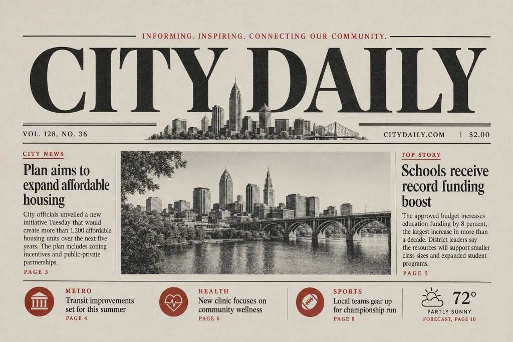
Shape newspaper city edition typography masthead into a complete scene where type, surface, and spacing work together. Keep the message exact: CITY DAILY. The letters should be complete, centered in the concept, and visually stronger than the background. Balance bold serif nameplate, dateline rhythm, and column-friendly spacing with quiet surrounding space so the final read feels authoritative, familiar, and editorial. The final image should feel appropriate for front page newspaper masthead, whether it appears as print, signage, packaging, or a digital layout. Finish with black ink, newsprint gray, red accent, and paper cream, clear foreground-background separation, and crisp type that stays readable at both close and distant views.
Try nowSimilar prompts


More Image Prompts
Emerald Sonar Abstract Cover Concentric Echo Rings
Paper Lantern Motion Still Translucent Folded Glow
Frequency Pearl Abstract Banner Iridescent Wave Interference
Sunset Graphite Presentation Title Smoky Pencil Gradient
Cloud Fossil Abstract Pattern Weathered Sediment Imprint