Atlas Spice Company Typography and Color System
Atlas Spice Company emphasizes spice branding and jar packaging, defining brand touchpoints examples for specialty food and retail packaging projects.
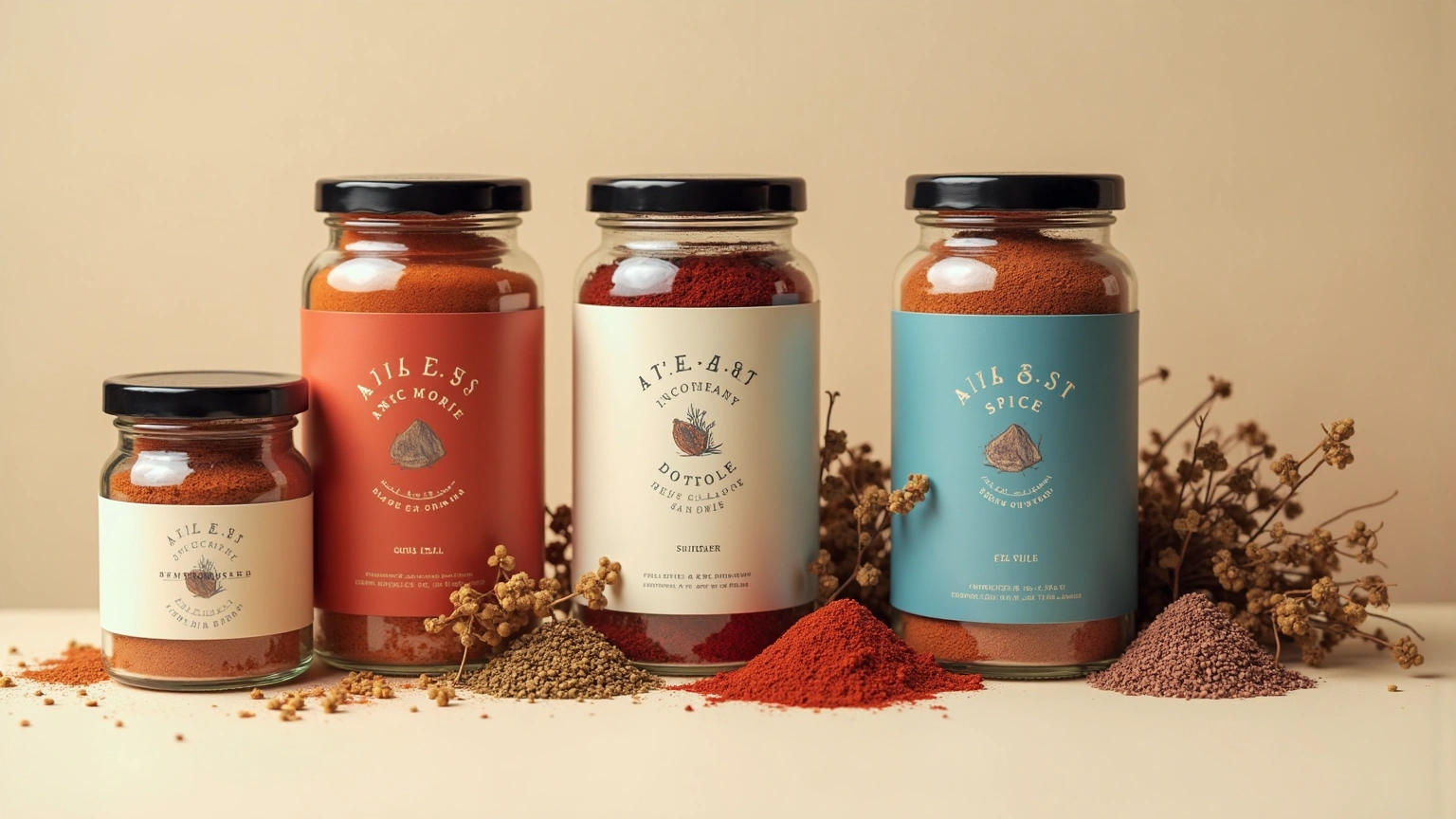
Let the first glance communicate atlas spice company immediately. A spice identity is shown across glass jars, paper refill packs, origin maps, tasting cards, market displays, and shipping boxes. Visual language for atlas spice company: favor an ownable visual language, restrained mockups, exact alignment, and a coherent relationship between mark and typography. Using a panoramic field, organize atlas spice company this way: build a staggered presentation from left to right, moving from primary mark to physical application to digital interface. Keep atlas spice company efficient and direct: use one dominant subject, unambiguous spatial order, and no competing decorative effects. Let spice branding establish the first read of atlas spice company, then use jar packaging to create a memorable secondary discovery. Tonal direction for atlas spice company: black, off-white, electric blue, and warm red with sharp graphic contrast. Complete atlas spice company with no copied marks, inconsistent colors, distorted mockups, unreadable type, or unrelated assets; preserve accurate proportions and purposeful detail.
Try now