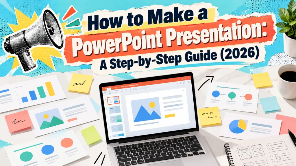
Presentation Design Rules: Fonts, Contrast, and Layout Basics
Professional slides are not defined by decoration. They are defined by clarity. A strong presentation helps the audience understand the message quickly, follow the logic, and trust that the information has been organized with care.
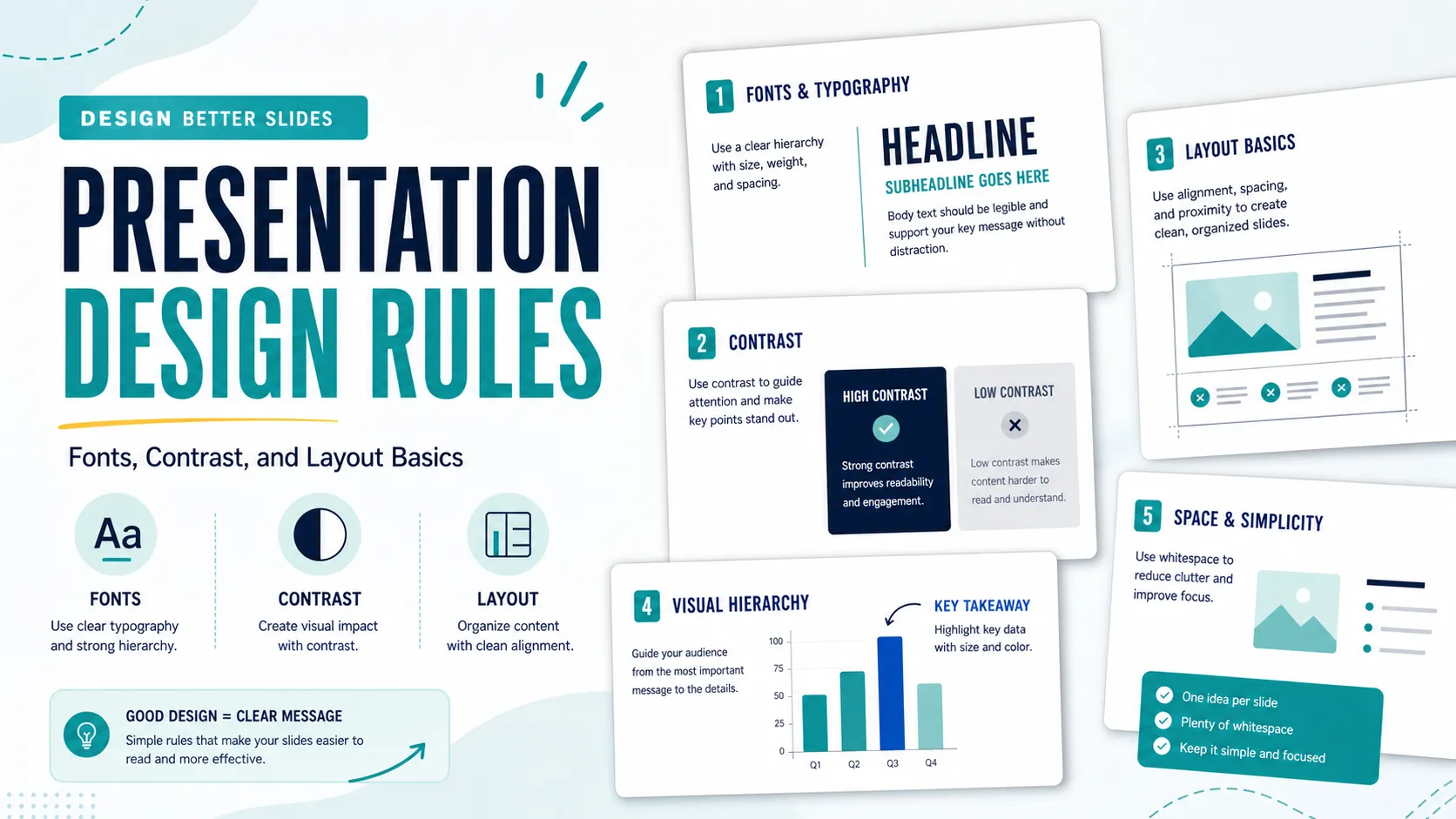
The most useful presentation design rules are simple and repeatable. You do not need to think like a graphic designer to improve your slides. You need better decisions about presentation fonts, slide contrast, spacing, alignment, visual hierarchy, and presentation layout. These basics reduce cognitive effort in business meetings, sales conversations, pitch decks, consulting reports, and executive briefings.
Why Presentation Design Rules Matter
A slide is not a document page. It is a visual aid meant to be understood while someone is listening. If a slide is crowded, low contrast, misaligned, or full of competing elements, the audience must work harder before they can understand the point.
Good design rules protect attention. They help people know where to look first, what matters most, and how each piece of information connects. The goal is not to make every slide dramatic. The goal is to make every slide feel intentional.
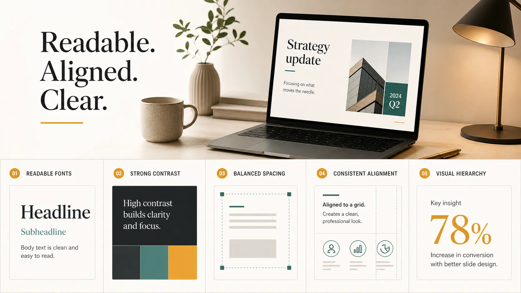
Rule 1: Choose Presentation Fonts for Readability
Readable presentation fonts are the foundation of good slide design. A font may look stylish in a poster or social graphic, but that does not mean it works in a meeting room, webinar, or executive review. Slides need typography that remains clear when projected, shared on screen, or viewed as a PDF.
Choose simple font families with clear letter shapes. Sans-serif fonts often work well for business presentations because they feel clean and modern, but consistency matters more than novelty. Avoid decorative fonts for body text, and be careful with overly thin typefaces that disappear on bright screens or low-quality projectors.
Limit font variety. In most decks, one font family is enough, especially if it includes regular, medium, and bold weights. Use size and weight to create hierarchy: a larger title, a clear subtitle or section label, and concise body text. The audience should immediately understand which text is the headline and which text supports it.
Rule 2: Use Slide Contrast to Improve Readability
Slide contrast is not just a visual preference. It is a readability rule. Text must stand out clearly from the background, charts must be easy to distinguish, and important information should be visually stronger than supporting details.
A common mistake is using light gray text on a white background or muted text over a busy image. These choices may look subtle on a designer’s monitor, but they often become difficult to read in real presentation conditions. If the audience has to squint, the slide is failing.
Contrast should also guide attention. Use accent colors to highlight key numbers, chart series, or callout phrases. But avoid using too many colors with equal intensity. When everything is bright, nothing feels important.
Rule 3: Build a Clear Presentation Layout
A clear presentation layout starts with one main idea per slide. This does not mean every slide must be minimal. It means the viewer should know the purpose of the slide within a few seconds. If a slide contains three unrelated messages, it may need to become three slides.
Good layout uses space deliberately. Margins should feel consistent. Related elements should be grouped together. White space should give the content room to breathe. A crowded slide often signals that the presenter has not decided what matters most.
When reviewing a slide, ask:
- What is the single message this slide needs to communicate?
- Can the audience understand the message without reading every word?
- Are related items visually grouped?
- Would the slide still work from the back of a room?
A useful layout is not empty or overdesigned. It is organized. It helps the audience move through the idea without guessing where to look next.
Rule 4: Use Alignment and Spacing to Create Order
Alignment makes a slide feel intentional. Even small inconsistencies can make a deck look unfinished: text boxes starting at slightly different positions, icons floating without structure, or charts placed too close to one edge.
The simplest alignment rule is to create consistent left edges. When titles, body text, charts, and captions share clear alignment points, the slide instantly feels more organized. You can also think in rows, columns, margins, and repeated positions, even if you do not draw an actual grid.
Spacing works the same way. Elements that belong together should be closer together. Elements that represent separate ideas should have more distance between them. Equal spacing between cards, bullets, icons, or chart panels creates rhythm and makes the slide easier to scan.
Rule 5: Create Visual Hierarchy Before Adding Style
Visual hierarchy tells the audience what to read first, second, and third. Without it, a slide becomes a flat collection of text and graphics. The viewer must decide what matters, which creates unnecessary effort.
Start with the headline. A strong presentation headline should communicate the point, not just label the topic. “Revenue increased 18% in enterprise accounts” is more useful than “Revenue Overview.” After the headline, use supporting text, charts, or callouts to explain the evidence.
Hierarchy can be created through size, weight, color, placement, and contrast. A key number can be larger than surrounding text. A chart label can highlight the main data point. A recommendation can sit in a callout box. But avoid too many emphasis styles. If every number, icon, and phrase is highlighted, the hierarchy collapses.
Quick Reference: Presentation Design Rules
| Design Area | Practical Rule | Common Risk |
|---|---|---|
| Presentation fonts | Use readable type and consistent weights | Decorative or thin fonts reduce clarity |
| Slide contrast | Make text, charts, and key points stand out | Low contrast makes slides hard to read |
| Presentation layout | Keep one clear message per slide | Crowded slides confuse the audience |
| Alignment | Use consistent edges and positions | Misalignment makes the deck feel unfinished |
| Visual hierarchy | Show what matters first | Too many highlights weaken emphasis |
A Simple Design Check Before You Present
Before presenting, review the full deck as an audience member rather than as the creator. Move quickly through the slides and notice where your attention goes. If you need to stop and interpret the layout, your audience will likely struggle too.
Check whether the text is readable from a distance, every slide has one clear message, and spacing feels consistent. Confirm that slide contrast is strong enough for different screens and that decorative elements do not distract from the argument. Look closely at charts, footnotes, and dense slides, where readability often breaks down.
This final pass is not about perfection. It is about removing friction. A business deck does not need to win a design award to be effective. It needs to help the audience understand the story with less effort.
How Pi Helps Apply Presentation Design Rules at Scale
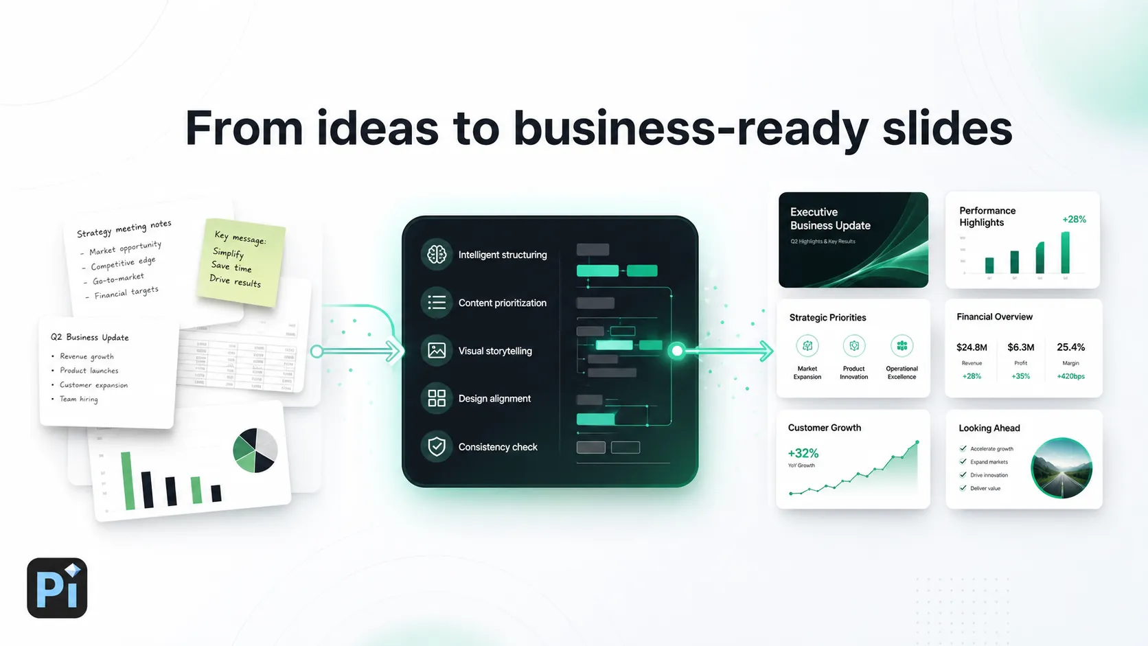
For one or two slides, you can apply design rules manually. The challenge becomes harder when a team needs a full business deck with consistent structure, polished visuals, and clear logic across many slides. Pi, short for Presentation Intelligence, is an AI presentation maker and AI PPT generator built for professional business presentations.
Pi helps teams move from raw ideas to business-ready structure and premium visual quality. Instead of only fixing isolated slides, it supports design principles across the full deck: clearer narratives, stronger slide hierarchy, consistent typography, balanced spacing, and more professional layout systems.
Many presentation problems begin before design. If the argument is unclear, better colors and fonts will not solve the issue. Pi helps shape the deck around business logic first, so the structure supports the purpose of the presentation. This matters for pitch decks, sales decks, consulting reports, market research decks, executive updates, and product launch presentations.
Pi also helps maintain a coherent visual system across typography, spacing, hierarchy, and layout. That consistency is important when multiple stakeholders contribute ideas or when a deck needs to be created quickly. Instead of treating design as a final cleanup step, Pi supports a connected workflow where structure, message, layout, and visual polish work together.
For professional teams, the value is not only speed. It is the ability to produce a deck that feels structured, readable, and aligned with the purpose of the meeting.
The Practical Verdict: Better Design Means Less Audience Effort
Good presentation design is not about making slides look busy, trendy, or heavily decorated. It is about reducing the effort required to understand the message. Fonts, contrast, layout, spacing, alignment, and hierarchy are practical communication tools.
When these rules work together, your slides feel clearer and more credible. The audience spends less time decoding the page and more time engaging with the idea. For teams that need polished, structured business presentations faster, Pi can help apply these principles consistently while keeping the focus on the message, not just the design.
Frequently Asked Questions (FAQ)
Q: What are the most important presentation design rules? A: Use readable fonts, strong slide contrast, one main idea per slide, consistent alignment, balanced spacing, and clear visual hierarchy.
Q: What fonts work best for presentations? A: Clean, readable fonts work best. Simple sans-serif fonts are often effective for business decks. Avoid decorative, overly thin, or hard-to-read fonts for body text.
Q: How much contrast should a slide have? A: A slide should have enough contrast for text, charts, and key visuals to be readable from a distance. Dark text on a light background or light text on a dark background usually works well.
Q: How can I improve presentation layout quickly? A: Give each slide one clear message, align objects to consistent edges, group related elements, remove clutter, and use white space to make the slide easier to scan.