CloudNine Planner App Productivity Tips LinkedIn Carousel
Start from cloudnine planner app productivity tips linkedin carousel as a flexible LinkedIn creative that turns cloudnine planner app into a clear campaign visual.
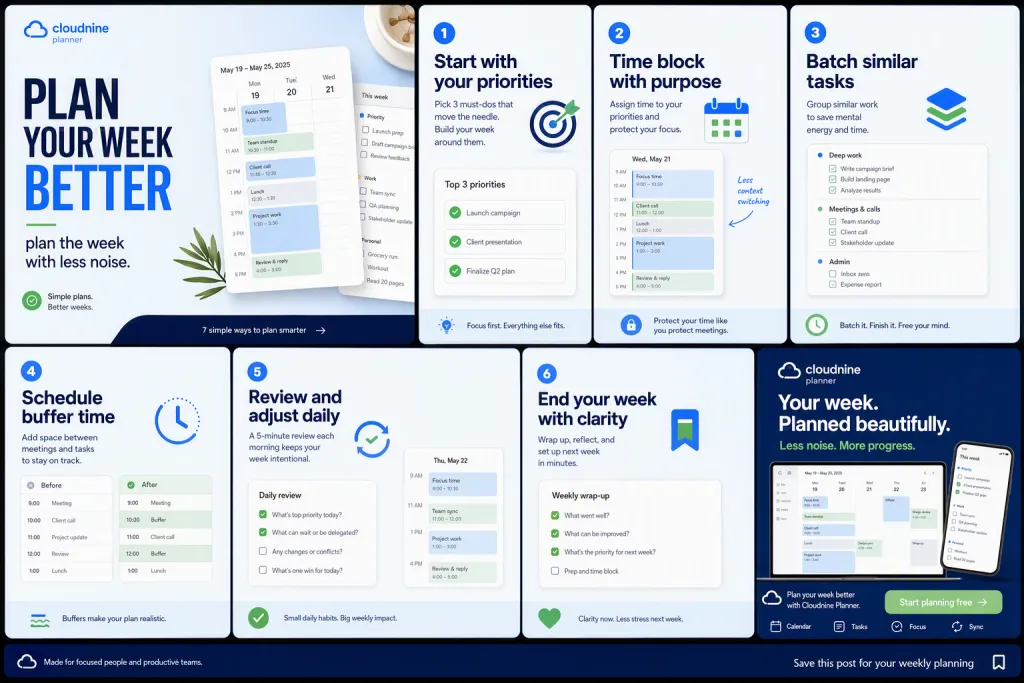
Start from cloudnine planner app productivity tips linkedin carousel: a social creative direction that makes cloudnine planner app easy to notice in a busy feed. Begin with calendar cards, task boards, and quiet desktop screenshots arranged in a workflow and make organized calendar modules and calm interface panels the main visual anchor. Place the exact headline PLAN YOUR WEEK BETTER in clean typography, then add secondary copy for plan the week with less noise. Visual style should be clean saas carousel design, with sky blue, deep navy, white, and soft green and careful contrast for mobile readability. The layout should use a seven-slide carousel with one productivity principle per card and a final app cta. Add authentic details such as checklist snippets, meeting blocks, and before-and-after schedule views so the prompt has a real campaign purpose and a natural posting context.
Try now