Kids Foam Alphabet Typography Learning Chart
Approach kids foam alphabet typography learning chart as a polished visual prompt where soft educational lettering typography becomes the central image.
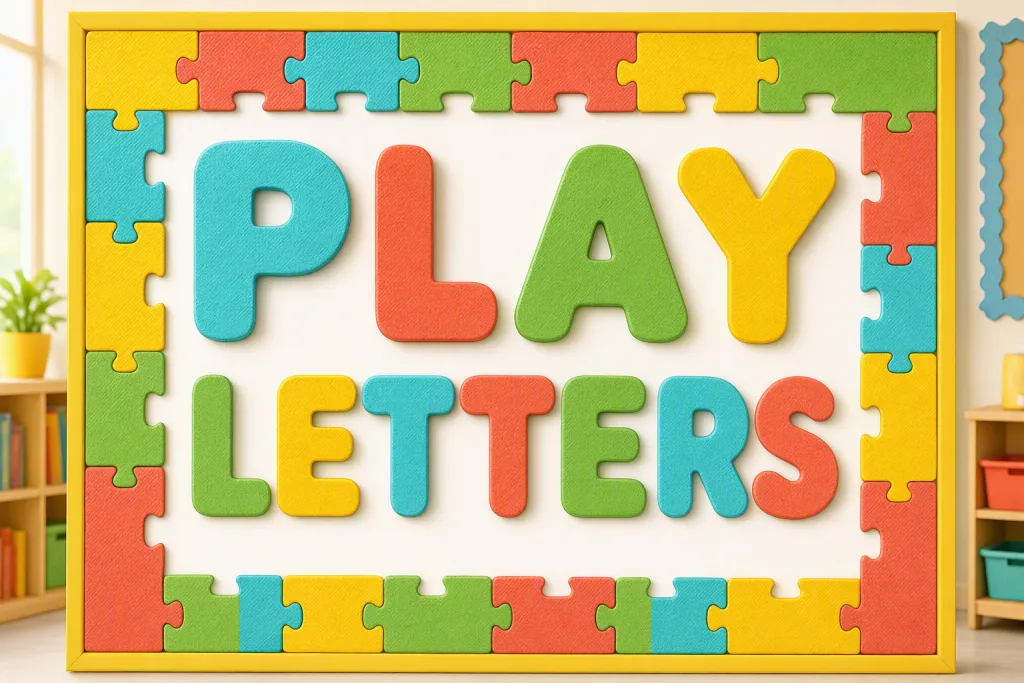
Frame kids foam alphabet typography learning chart around a clear commercial use case: preschool classroom alphabet poster. Set the readable wording to PLAY LETTERS; do not add extra slogans, filler words, or decorative characters that compete with it. Build visual interest through chunky foam shapes, friendly shadows, and clear letter recognition, while the overall layout remains cheerful, readable, and age-appropriate. Keep the setting tied to preschool classroom alphabet poster, but avoid letting props or background details overpower the letterforms. The color story is sunny yellow, aqua, coral, green, and white, supported by sharp contours, believable texture, and a professional amount of whitespace.
Try now