Kinetic Music Lyric Typography Album Cover
Present kinetic music lyric typography album cover for indie album cover artwork, making LOUDER STILL clear, expressive, and visually distinct.
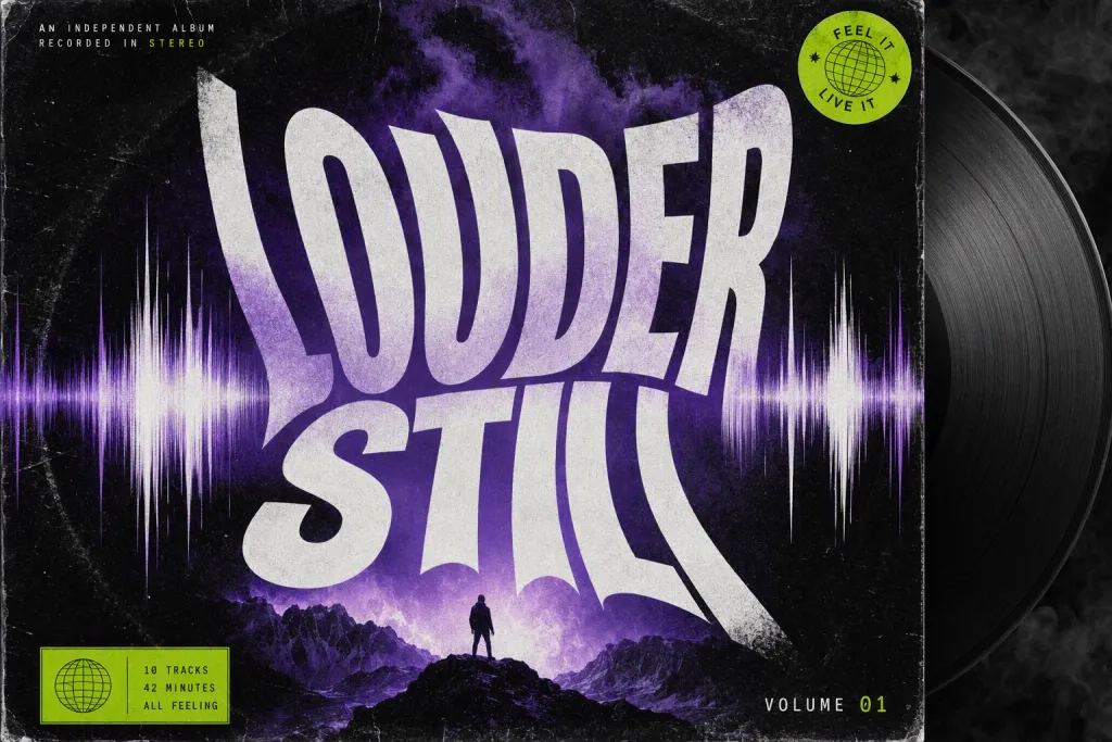
Shape kinetic music lyric typography album cover into a complete scene where type, surface, and spacing work together. Use LOUDER STILL as the hero phrase, keeping every character readable while allowing the style to influence weight, rhythm, and texture. Let letters stretching like sound waves with rhythmic spacing guide the structure, from the first large letter to the smallest supporting spacing decision. Place the design in the context of indie album cover artwork, using realistic surface treatment and a purposeful crop. Work in deep purple, white, lime, and smoky black; keep lighting clean, strokes consistent, and the typography free from misspellings or random marks.
Try now