Fern and Foundry Brand Visual Identity
Lead with fern and foundry brand visual identity as an urban plant studio that merges industrial materials with lush botanical life.
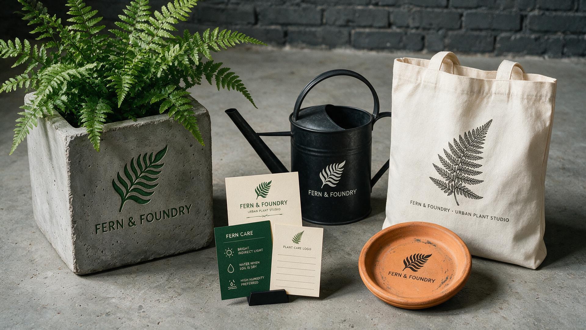
Lead with fern and foundry brand visual identity as an urban plant studio that merges industrial materials with lush botanical life. The system includes a concrete planter with a fern, a metal watering can, a plant care card set, a canvas tote with a botanical print, and a terracotta saucer. Art direction: Use the contrast of rough industrial textures and delicate botanical forms. Within an expansive horizontal canvas, place the concrete planter and fern on the left, the watering can and cards across the center, and the tote and saucer on the right. Light and palette: Concrete gray, deep green, terracotta, black, and cream. Build a coherent identity system with repeatable visual rules, refined mockups, consistent typography, and tactile production details. Keep the identity consistent across every asset; avoid copied marks, warped packaging, unreadable type, and redundant props.
Try now