Typography Mistakes Designer Fix Guide
A practical guide for designers highlighting the most common typography mistakes and how to fix them for more professional results.
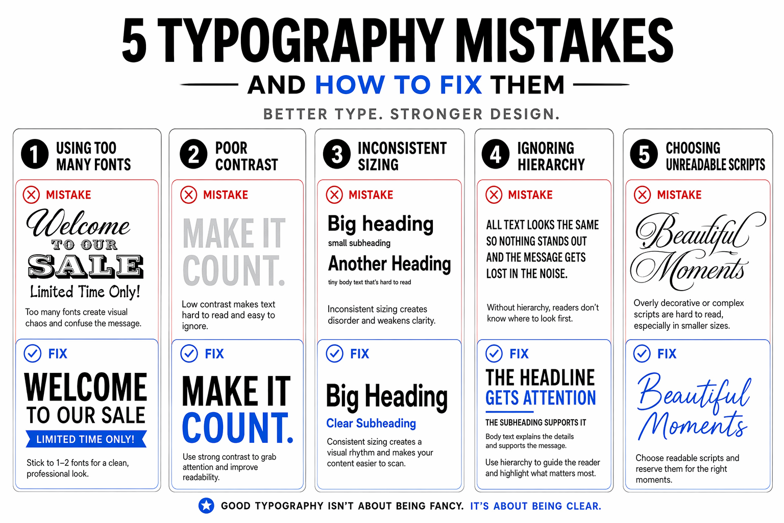
Turn this typography lesson into a clear educational carousel. A five-card guide covers common pitfalls: using too many fonts, poor contrast, inconsistent sizing, ignoring hierarchy, and choosing unreadable scripts. Each card shows an example of the mistake and a clear fix. Composition: Use a clean white background with bold typography examples, using red for mistakes and blue for fixes. Light and color: Clean white, crisp black, error red, and correction blue. Creative direction: Create an essential typography guide that's immediately useful for designers of all levels. Design a scroll-stopping campaign visual with an immediate message hierarchy, platform-ready polish, clear subject separation, and space for concise copy. Keep the headline and details exact and readable at thumbnail size; avoid platform chrome, engagement counters, and overcrowding.
Try now