Typography Mistakes Designer Fix Guide
A practical guide for designers highlighting the most common typography mistakes and how to fix them for more professional results.
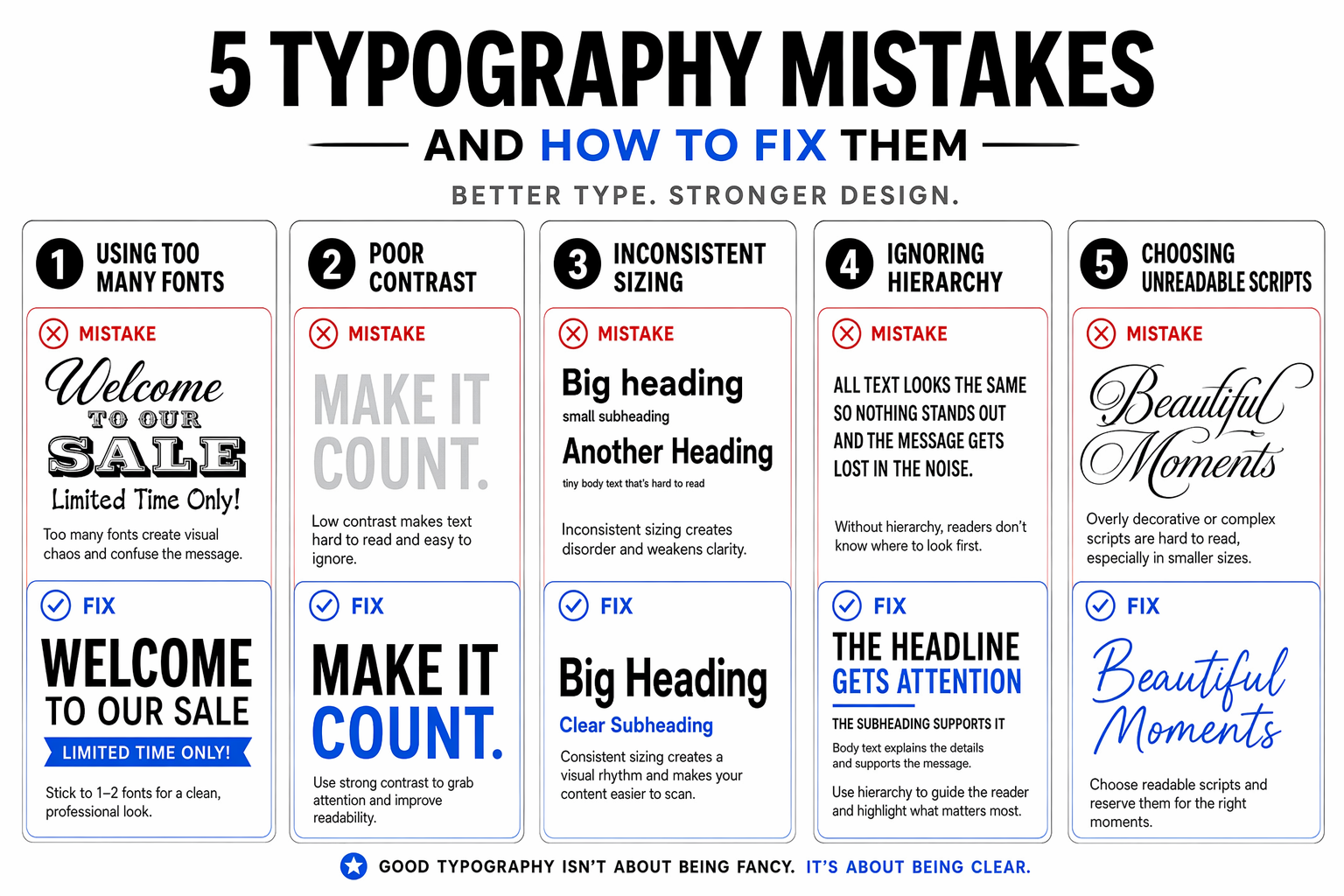
Turn this typography lesson into a clear educational carousel. A five-card guide covers common pitfalls: using too many fonts, poor contrast, inconsistent sizing, ignoring hierarchy, and choosing unreadable scripts. Each card shows an example of the mistake and a clear fix. Composition: Use a clean white background with bold typography examples, using red for mistakes and blue for fixes. Light and color: Clean white, crisp black, error red, and correction blue. Creative direction: Create an essential typography guide that's immediately useful for designers of all levels. Design a scroll-stopping campaign visual with an immediate message hierarchy, platform-ready polish, clear subject separation, and space for concise copy. Keep the headline and details exact and readable at thumbnail size; avoid platform chrome, engagement counters, and overcrowding.
Try nowSimilar prompts




More Image Prompts
Independent Watchmaker Horology Bench Portrait
Coastal Ferry Terminal Waterfront Transport Architecture
No Shortcuts Road Sign Endurance Typography Poster
Firefly Meadow Night Long Exposure Photography
Night Shift Nurse Hospital Station Editorial Portrait