Budget Tracking Spending Category Breakdown
Explore budget tracking dashboard UI with financial planning and category breakdown for spending analysis and visualization.
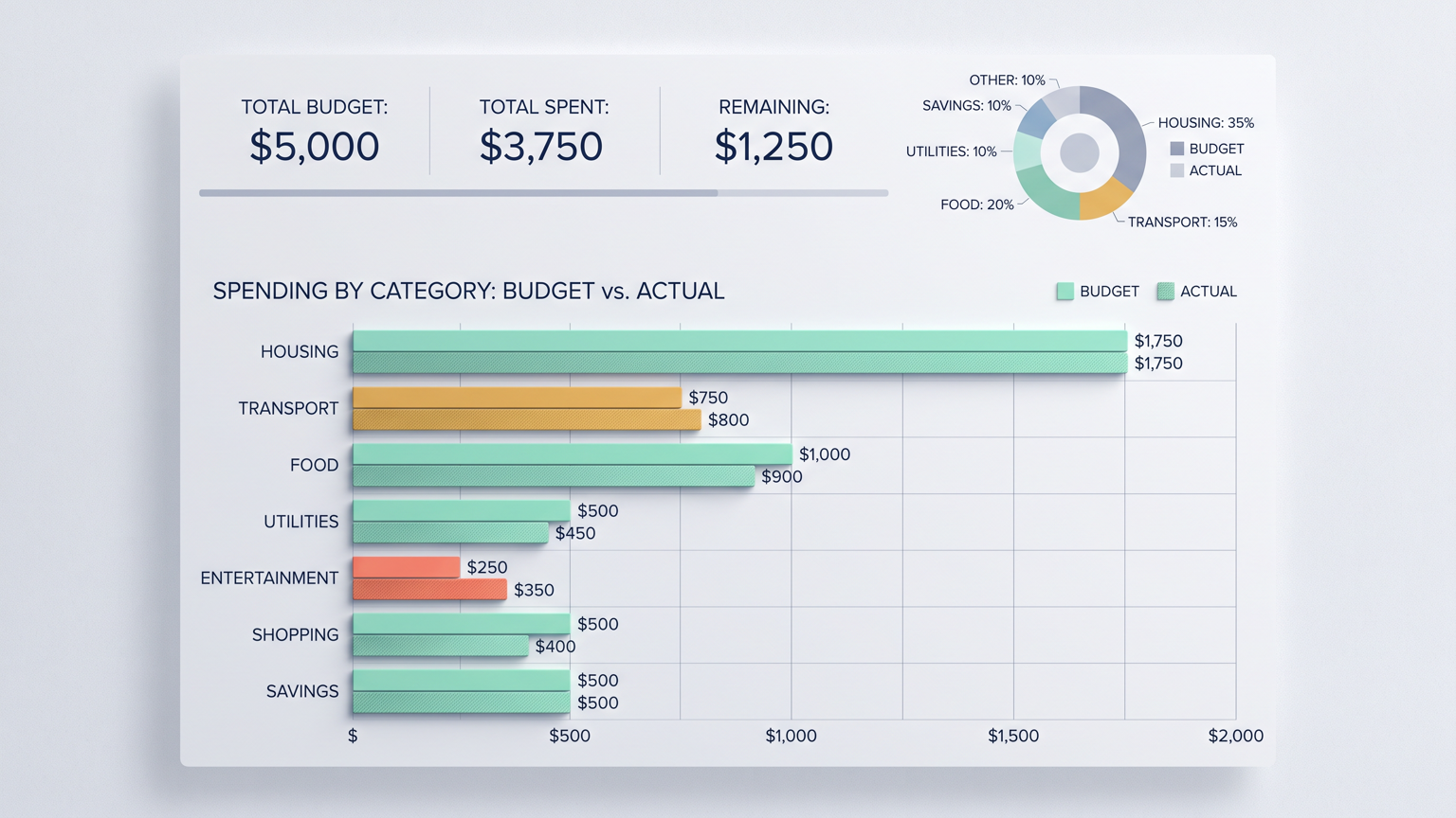
Design a budget tracking dashboard with clear spending category breakdown. A horizontal bar chart shows spending by category with budget vs. actual comparison bars side by side. A small donut chart above shows overall allocation percentages. Summary metric cards sit at the top displaying total budget, total spent, and remaining amount. The palette is financial: clean white, navy text, coral for overspend, mint green for on-budget, amber for near-limit, and soft gray dividers. Use realistic budget data with proper currency formatting. Avoid placeholder text, overlapping elements, decorative clutter, and exaggerated visual effects.
Try nowSimilar prompts