Connected Telehealth Portal Mobile App UX
Connected Telehealth Portal organizes telehealth UI and patient portal, positioning dashboard hierarchy reference for digital health product presentations.
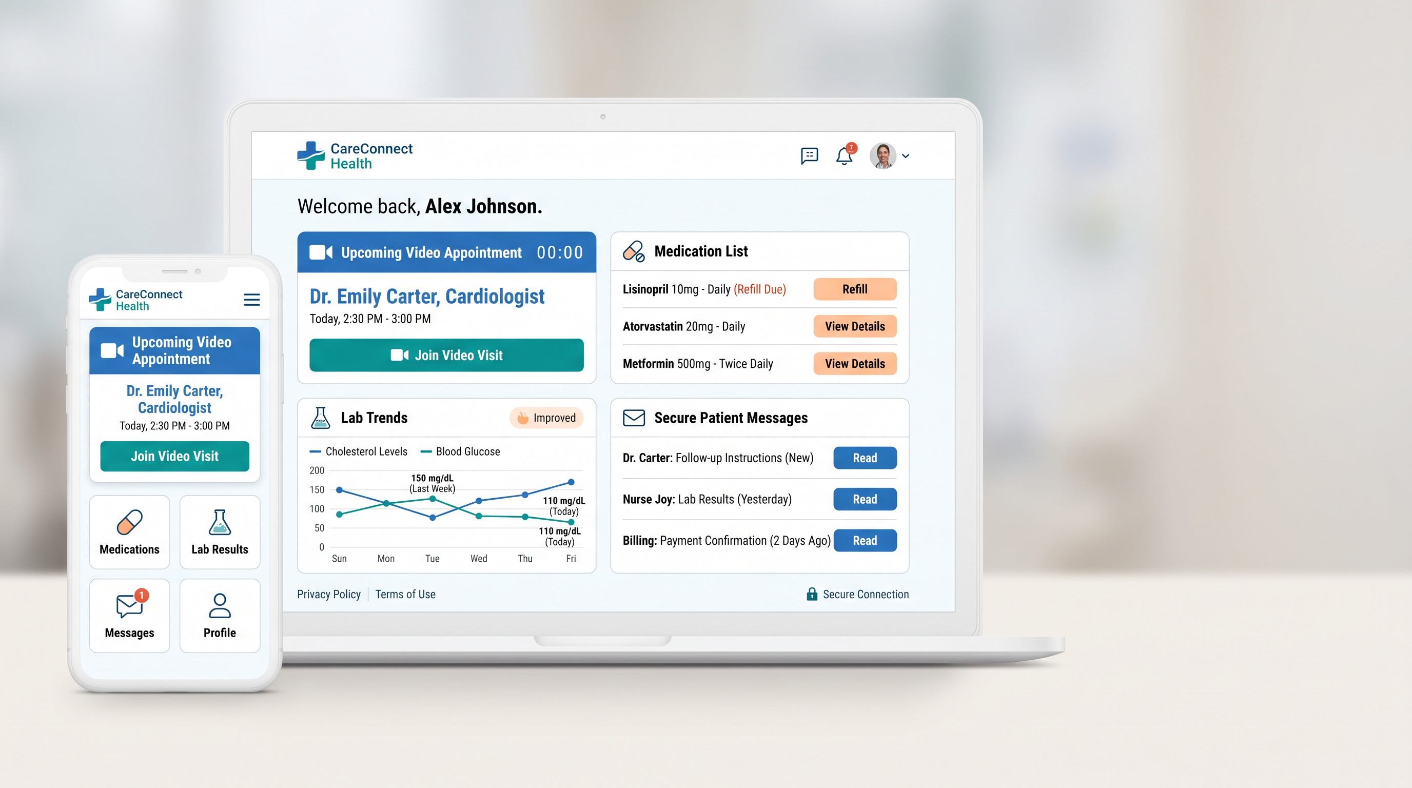
Present connected telehealth portal with a clear hierarchy and a memorable focal point. A responsive healthcare portal shows an upcoming video appointment, medication list, lab trends, and secure patient messages. In connected telehealth portal, render every requested word, label, number, and interface state exactly as written and fully legible. Finish connected telehealth portal with the clarity expected from telehealth portal UI design, including clean separation and intentional negative space. Within a long visual field, organize connected telehealth portal this way: present a laptop dashboard in the center with one mobile companion screen on the left and a spacious neutral field on the right. Campaign aesthetic for connected telehealth portal: design an empathetic clinical interface with strong accessibility, readable data, reassuring iconography, and clear privacy cues. Atmospheric color for connected telehealth portal: clean white, medical blue, teal, and warm peach accents. Ensure connected telehealth portal feels presentation-ready with a clear hierarchy and clean negative space. The final connected telehealth portal must be clear of gibberish copy, misaligned components, contradictory states, impossible devices, or decorative noise, with no accidental visual noise.
Try now