Riverside Mill Flour Company Packaging Branding System
A heritage flour mill packaging design system with Riverside Mill Flour Company for heirloom grain and artisan flour brand positioning.
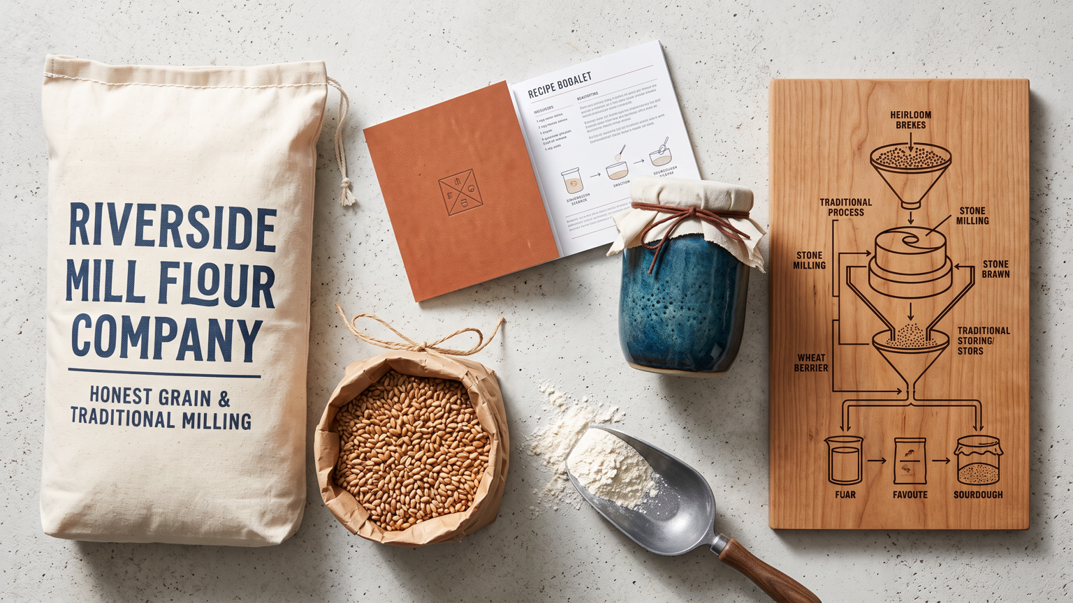
The image opens on a heritage flour mill packaging system for Riverside Mill Flour Company built around honest grain and traditional milling. The system includes a canvas flour sack with bold lettering, a paper bag of heirloom wheat berries, a wooden milling diagram, a branded recipe booklet, a ceramic jar of sourdough starter, and a stamped metal scoop. Color atmosphere: Cream flour, wheat gold, denim blue, rust, and warm wood. Styling approach: Combine authentic industrial heritage with modern craft food cues and clear product hierarchy. Build a coherent identity system with repeatable visual rules, refined mockups, consistent typography, and tactile production details. Structure the composition for a broad display: place the flour sack and bag on the left, arrange the booklet and jar across the center, and let the milling diagram sit on the right. Keep the identity consistent across every asset; avoid copied marks, warped packaging, unreadable type, and redundant props.
Try now