Wealth Portfolio Dashboard Pixel-Perfect Data Viz
For investment portfolio dashboard UI with wealth management and data visualization, designed for financial app and high-fidelity interface design.
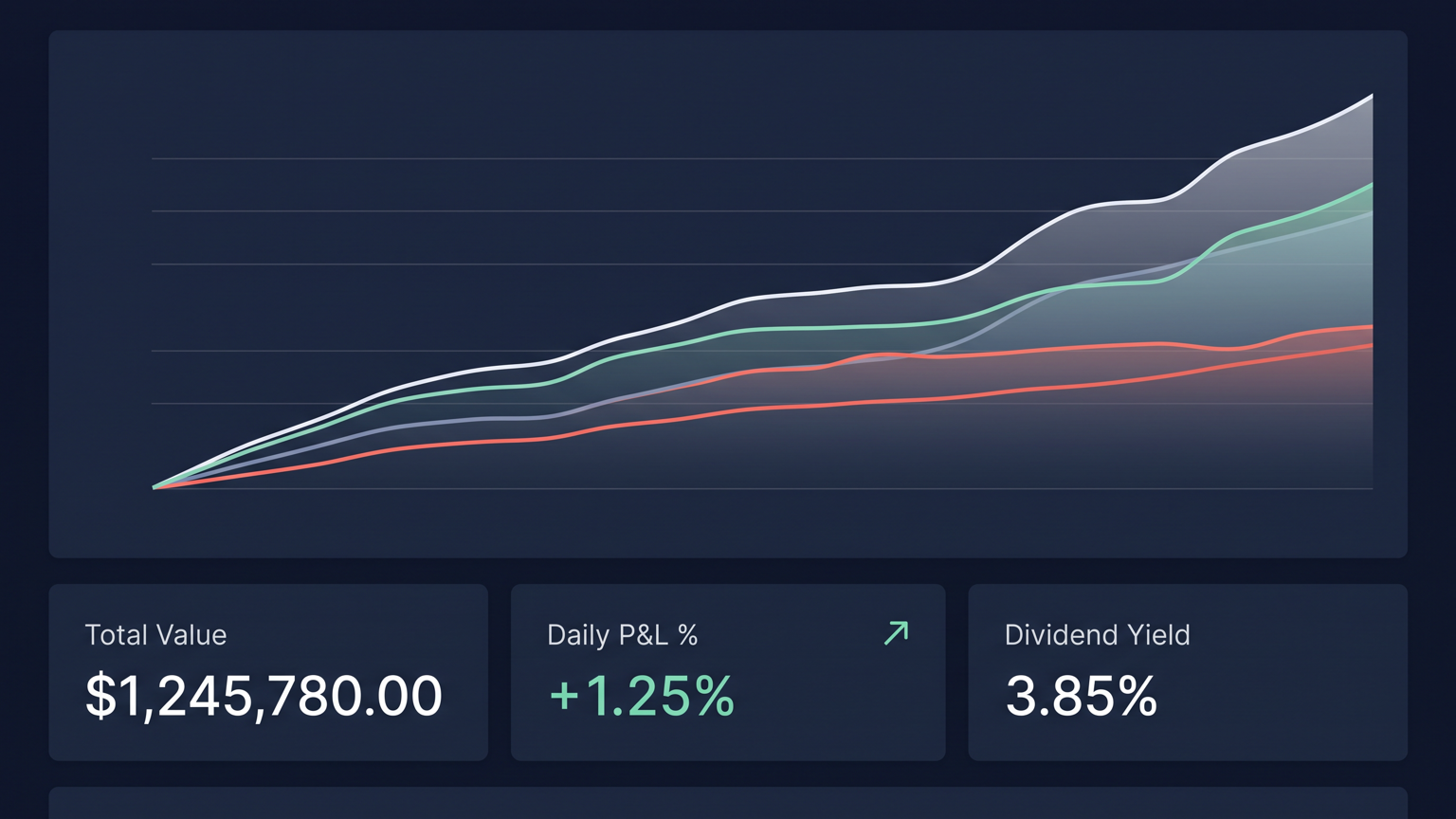
Render a wealth management portfolio dashboard where every pixel serves a purpose. A multi-line chart dominates the upper section with anti-aliased curves, precise gradient fills beneath each line, and subtle hover-state tooltips. Three compact metric cards sit below displaying total value, daily P&L percentage, and dividend yield with crisp sans-serif numbers. The color palette remains restrained: deep navy backgrounds, white text, mint green for gains, coral red for losses, and hairline gray dividers. Every data point is legible at a glance with exact decimal alignment. Avoid placeholder text, overlapping elements, decorative clutter, and exaggerated visual effects.
Try now