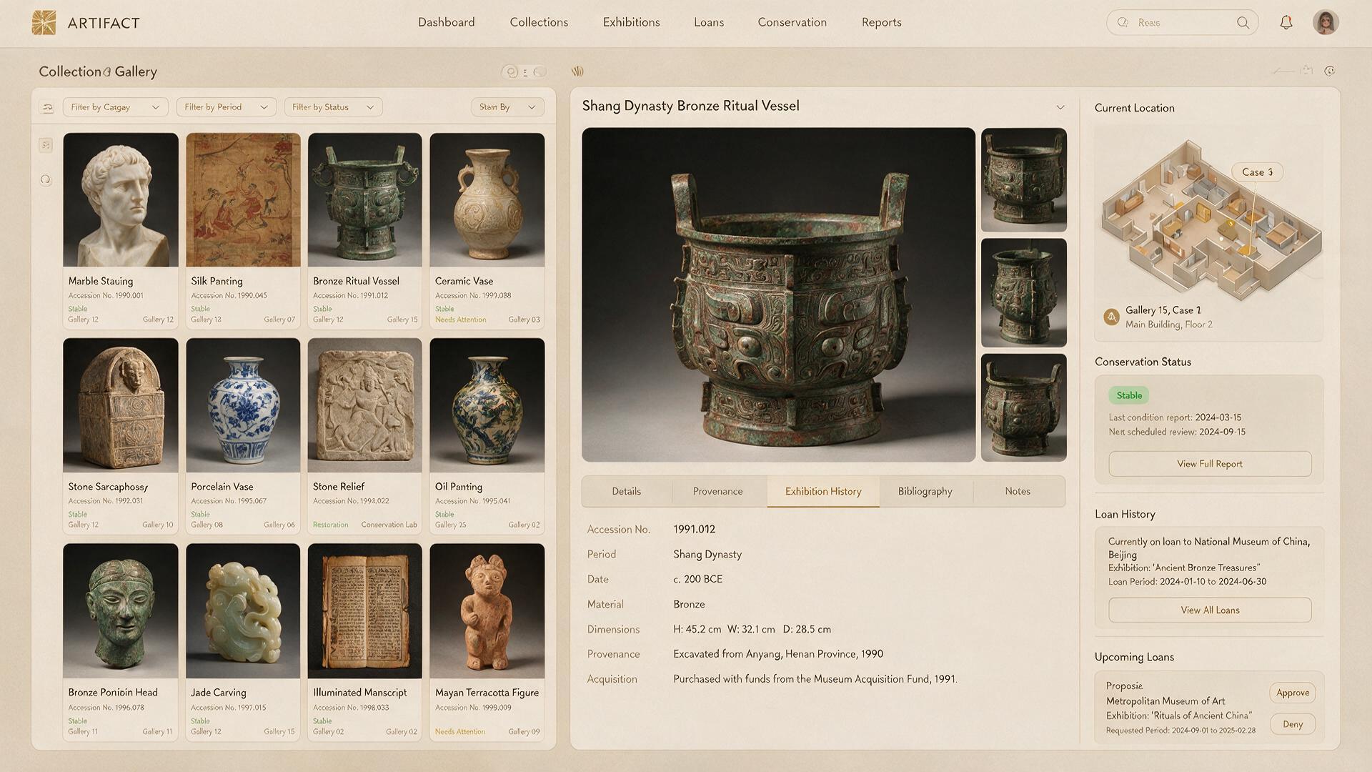
Neighborhood Commons App Service Design Interface
Neighborhood Commons App interprets community app and civic technology, providing workflow clarity ideas within community technology portfolios.
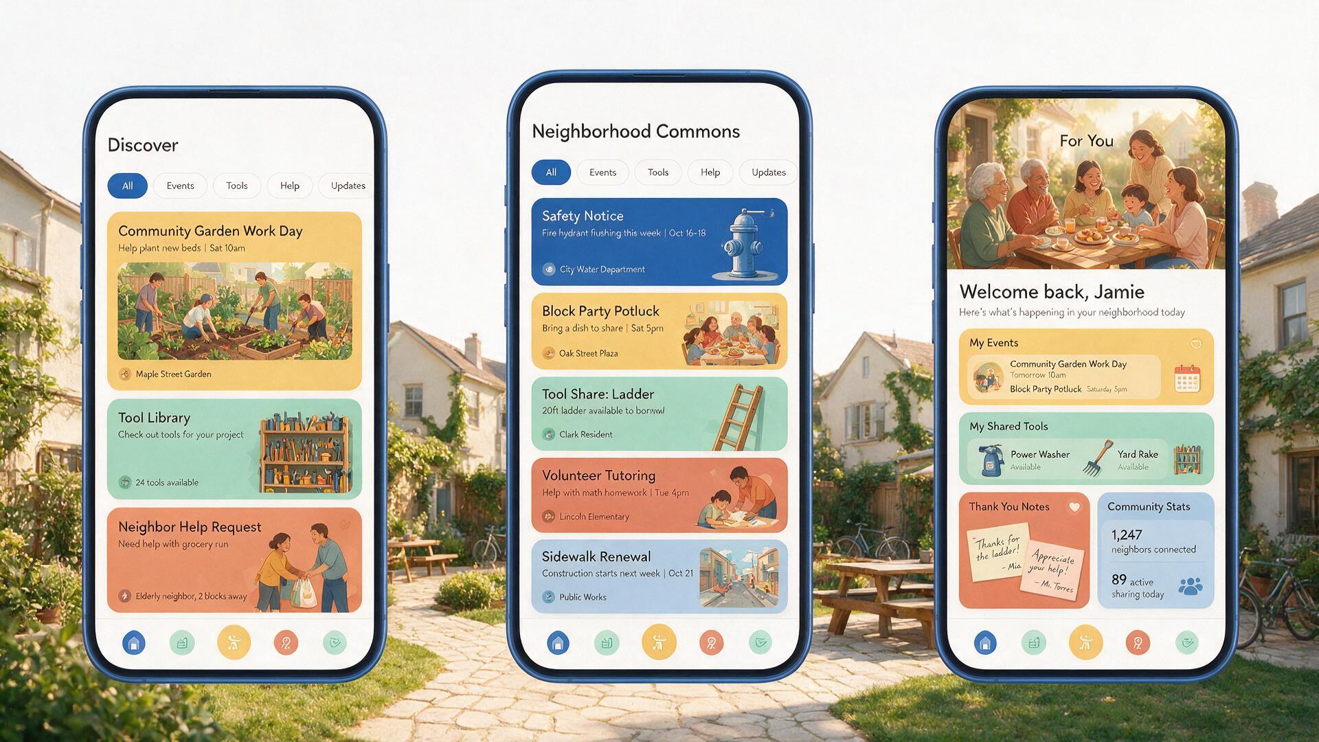
The first read is neighborhood commons app. A local community app combines nearby events, tool sharing, volunteer requests, neighborhood updates, and trusted safety notices. Color atmosphere for neighborhood commons app: cobalt, warm yellow, terracotta, mint, and white. Styling approach for neighborhood commons app: design a friendly civic interface with authentic local content, simple filters, accessible type, and warm human-centered illustrations. Within a spacious horizontal canvas, organize neighborhood commons app this way: show three mobile screens across the lower frame, make the community feed central, and keep a bright background area open above. Allow neighborhood commons app to carry layered narrative and spatial detail while maintaining stable perspective, material continuity, and a refined high-resolution finish. Give neighborhood commons app credible scale and depth; make community app clear first and reward closer viewing with civic technology. Maintain convincing depth and clean edge separation throughout neighborhood commons app. For neighborhood commons app, reject gibberish copy, misaligned components, contradictory states, impossible devices, or decorative noise, and keep the defining subject clear at every viewing size.
Try now