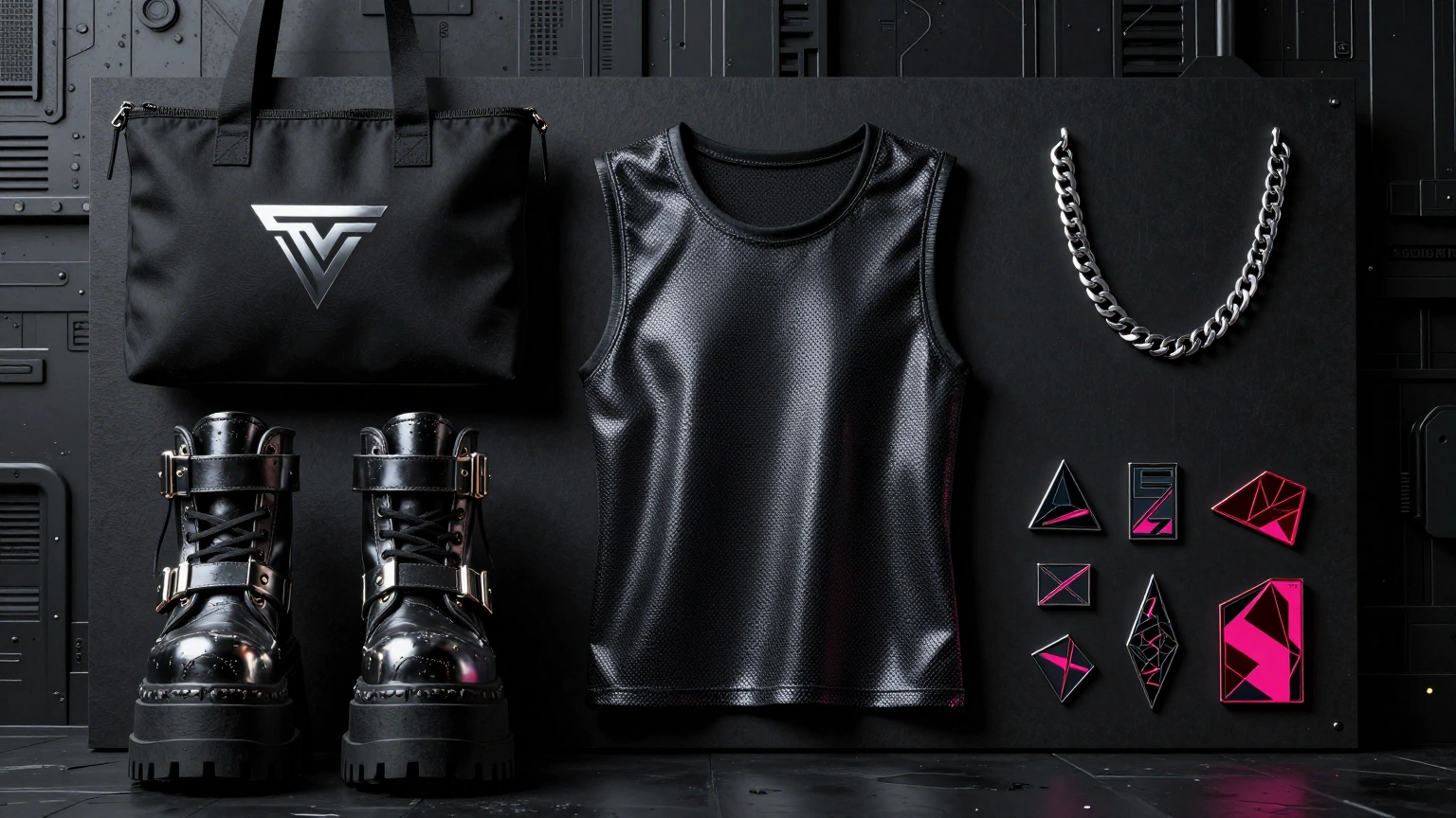
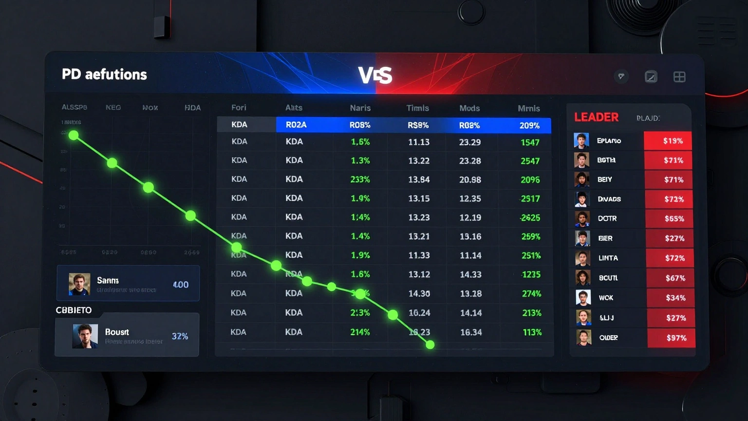
Harvest Table Festival Identity Application Suite
Harvest Table Festival organizes food festival and event identity, positioning identity rollout examples for food event and destination branding.
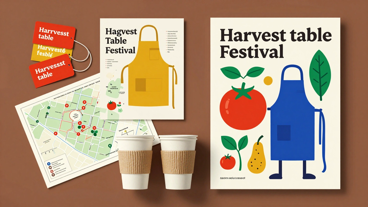
Start from this specific editorial premise: A regional food festival identity appears on posters, vendor signs, tasting tokens, aprons, maps, and reusable cups. For strong side-to-side flow, organize harvest table festival this way: build the event poster on the right, scatter tokens and maps on the left, and keep a clear title area. Creative treatment for harvest table festival: use bold ingredient illustration, modular event typography, and a joyful but organized system. Keep harvest table festival faithful to the practical expectations of food festival brand identity, with coherent geometry and spatial relationships. Illumination for harvest table festival: tomato red, mustard, leaf green, cobalt, and cream. Keep harvest table festival concise and economical: prioritize silhouette, major color blocks, one lighting condition, and an obvious focal subject. Quality control for harvest table festival: no copied marks, inconsistent colors, distorted mockups, unreadable type, or unrelated assets; retain natural depth and a decisive main read.
Try nowSimilar prompts