Museum Audio Guide Title Typography Kiosk Screen
Frame museum audio guide title typography kiosk screen around the words LISTEN CLOSE, with large readable headline, button-friendly type sizes, and calm hierarchy and a palette of dark slate, white, cyan, and warm gray.
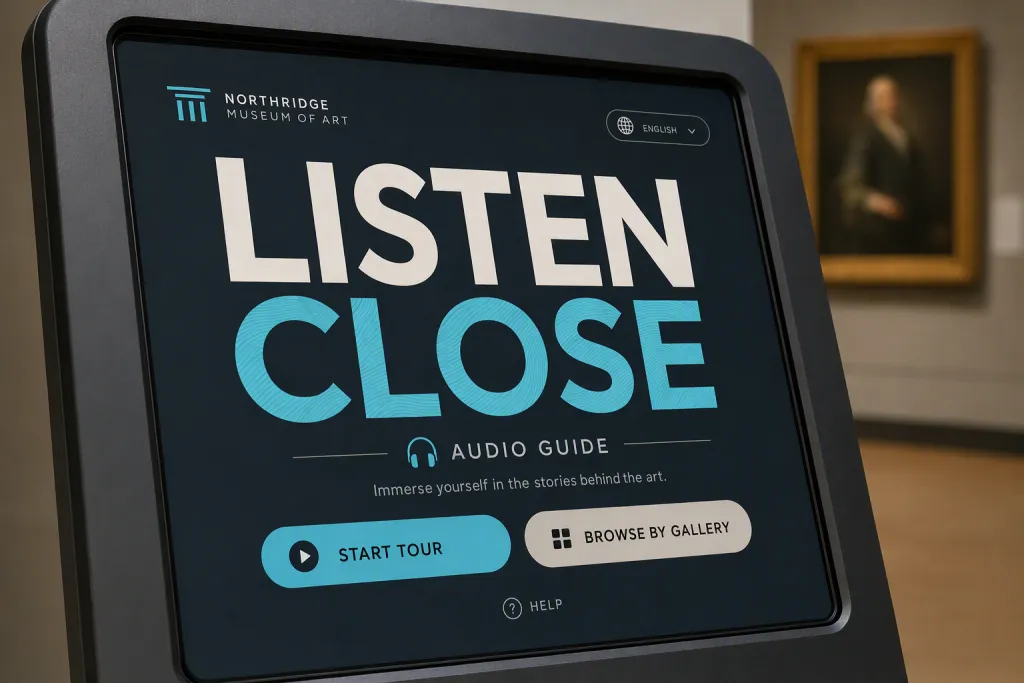
Lead with museum audio guide title typography kiosk screen: make the words feel like the product, not a caption. Use LISTEN CLOSE as the hero phrase, keeping every character readable while allowing the style to influence weight, rhythm, and texture. Let large readable headline, button-friendly type sizes, and calm hierarchy guide the structure, from the first large letter to the smallest supporting spacing decision. Place the design in the context of museum audio guide touchscreen, using realistic surface treatment and a purposeful crop. Work in dark slate, white, cyan, and warm gray; keep lighting clean, strokes consistent, and the typography free from misspellings or random marks.
Try nowSimilar prompts


More Image Prompts
Frequency Pearl Abstract Banner Iridescent Wave Interference
Sunset Graphite Presentation Title Smoky Pencil Gradient
Cloud Fossil Abstract Pattern Weathered Sediment Imprint
Horizon Glass Brand System Transparent Layered Planes
Velvet Calculus Data Art Flowing Equation Ribbons