Music Festival Stages Typography Lineup Poster
For music festival stages typography lineup poster, create a readable lineup poster built around separate stage columns, bold time hierarchy, and energetic headline type and the phrase THREE STAGES.
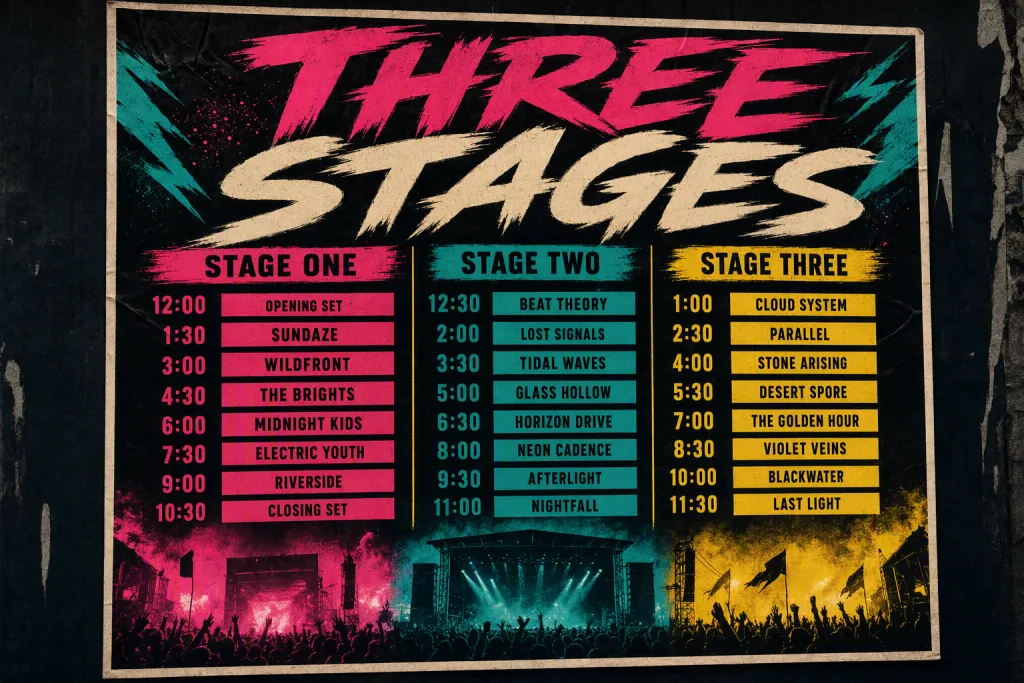
Use music festival stages typography lineup poster to turn practical lettering into a polished visual concept. The exact phrase THREE STAGES must appear as the only primary wording, spelled correctly with intentional kerning and clean letter shapes. Emphasize separate stage columns, bold time hierarchy, and energetic headline type, then arrange the composition so it feels organized, energetic, and schedule-friendly. The scene should clearly suggest multi-stage music festival poster, with materials, scale, and viewing angle chosen to make the typography believable. Use black, cream, magenta, yellow, and teal with controlled contrast, accurate edges, and no visible watermarks, fake logos, broken text, duplicate letters, or clutter.
Try now