Organic Matcha House Packaging Branding Ingredient Emblem
Shape Organic Matcha House Packaging Branding Ingredient Emblem as a calm Japanese inspired brand prompt for minimal tea counter, with ingredient emblem assets that feel memorable and usable.
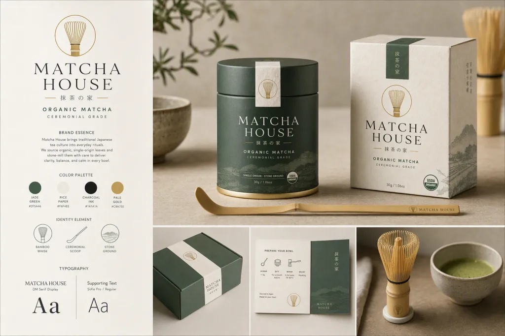
Treat organic matcha house packaging branding ingredient emblem from the needs of matcha drinkers and tea gift buyers. Show how the brand would appear in a real environment: minimal tea counter, tactile materials, coherent typography, and one memorable identity element built around powder tin, bamboo whisk emblem, ceremonial scoop. Keep the look calm Japanese inspired, using jade green, rice paper, charcoal ink, pale gold as the main color story. Balance aesthetic polish with clear commercial function across every brand touchpoint. Arrange the deliverables as a realistic brand presentation, with one clear hero object, two supporting pieces, and a tidy background that feels commercially usable. Make the brand system feel ready for a portfolio, with realistic scale, tidy alignment, sharp paper details, and no distorted lettering or stray interface elements.
Try now