Variable Font Axis Typography Specimen Card
Treat variable font axis typography specimen card as a focused lettering concept for digital type specimen card, balancing variable font demonstration with technical, educational, and visually clear composition.
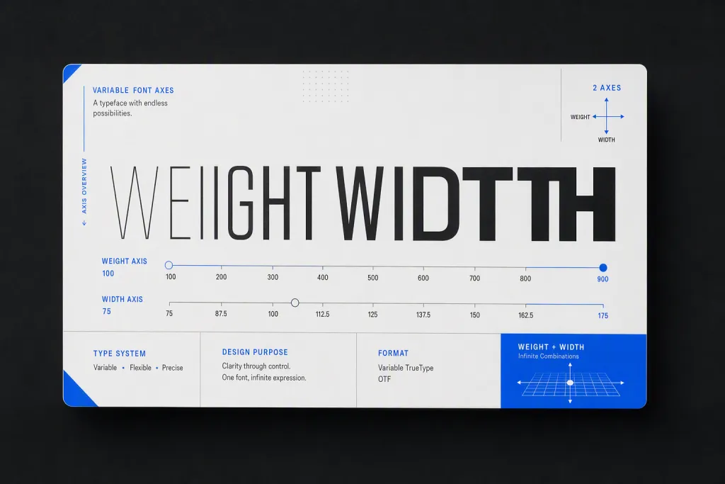
Present variable font axis typography specimen card as a finished design asset rather than a loose lettering sketch. The exact phrase WEIGHT WIDTH must appear as the only primary wording, spelled correctly with intentional kerning and clean letter shapes. Emphasize letters shifting from light to bold across a clean axis scale, then arrange the composition so it feels technical, educational, and visually clear. The scene should clearly suggest digital type specimen card, with materials, scale, and viewing angle chosen to make the typography believable. Use white, black, electric blue, and pale gray with controlled contrast, accurate edges, and no visible watermarks, fake logos, broken text, duplicate letters, or clutter.
Try now