Wellness Pharmacy Label Typography Shelf Strip
Approach wellness pharmacy label typography shelf strip as a polished visual prompt where clean pharmacy typography becomes the central image.
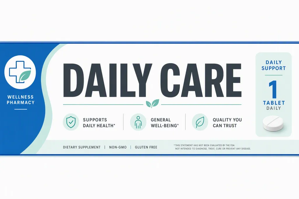
Design wellness pharmacy label typography shelf strip as a useful image prompt for a real visual communication need. Keep the message exact: DAILY CARE. The letters should be complete, centered in the concept, and visually stronger than the background. Balance small product descriptors, confident sans-serif headline, and dosage-friendly spacing with quiet surrounding space so the final read feels trustworthy, clear, and retail-useful. The final image should feel appropriate for wellness product shelf label, whether it appears as print, signage, packaging, or a digital layout. Finish with white, clinical blue, mint, and dark gray, clear foreground-background separation, and crisp type that stays readable at both close and distant views.
Try now