Pumice and Pine Apothecary Brand Visuals
Imagine the following visual world for a natural apothecary brand visuals system with Pumice and Pine rooted in mountain botanicals.
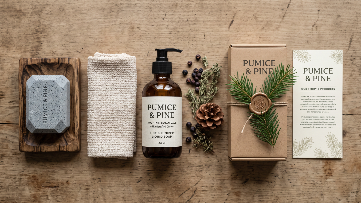
Imagine the following visual world: A natural apothecary brand visuals system for Pumice and Pine is rooted in mountain botanicals and handcrafted care. The system includes a bar of pumice soap on a wooden soap dish, a liquid soap bottle, a pine cone and dried herbs, a cotton washcloth, a product brochure, and a gift box with a pine branch. Balance the frame from left to right: place the soap and dish on the left, arrange the bottle and herbs across the center, and let the brochure and gift box sit on the right. Palette, contrast, and light: Pine green, pumice grey, cream, brown, and soft amber. Use authentic apothecary photography with realistic soap texture, botanical detail, and a clean natural atmosphere. Build a coherent identity system with repeatable visual rules, refined mockups, consistent typography, and tactile production details. Keep the identity consistent across every asset; avoid copied marks, warped packaging, unreadable type, and redundant props.
Try nowSimilar prompts