Data Storytelling Framework: Turning Numbers into a Compelling Business Narrative
Numbers alone rarely inspire action. A spreadsheet may be accurate, a dashboard may be detailed, and a chart may be technically correct, but business audiences do not make decisions from data volume. They make decisions when the meaning is clear.
That is why data storytelling matters in modern presentations. Whether you are preparing an executive update, sales deck, consulting report, market research deck, or internal strategy review, your goal is not simply to show metrics. Your goal is to help the audience understand what changed, why it matters, and what should happen next.
A strong data storytelling framework gives structure to analysis. It turns scattered numbers into a business narrative that supports decision-making, alignment, and action.
Why Data-Heavy Presentations Often Fail
Many data-heavy presentations fail even when the analysis is solid. The problem is usually not the data itself. The problem is how the data is sequenced, explained, and visualized.
Common failure points include:
- Too many charts competing for attention
- Slide titles that describe the chart instead of stating the insight
- Metrics shown without business context
- Weak sequencing between problem, evidence, and recommendation
- Visual complexity that forces the audience to interpret everything alone
In these situations, the presenter may feel well prepared because every number is included. The audience, however, may feel uncertain because the argument is hidden inside the data. A presentation should not ask executives, clients, or stakeholders to decode the message from scratch.
What Data Storytelling Really Means
Data storytelling is the disciplined combination of insight, narrative, and visual clarity. It is not about decorating charts, removing nuance, or making weak data sound more persuasive than it is. It is about presenting data effectively https://hbr.org/2013/04/how-to-tell-a-story-with-data so the audience can follow the logic behind a business conclusion.
Good data storytelling answers three questions. What is the key insight? Why does it matter now? What decision or action should follow?
This is especially important in business presentations, where attention is limited and stakes can be high. A CFO reviewing margin trends, a sales leader evaluating pipeline health, or an investor assessing market traction does not need every available metric on the first slide. They need a clear path from evidence to implication.
A Practical Data Storytelling Framework
A repeatable framework helps prevent data from becoming a slide dump. Use the following five steps before building the deck, not after the slides are already crowded.
1. Start with the Business Decision
Begin by defining what the audience needs to decide, approve, understand, or change. This step keeps the presentation focused on business value rather than analytical completeness.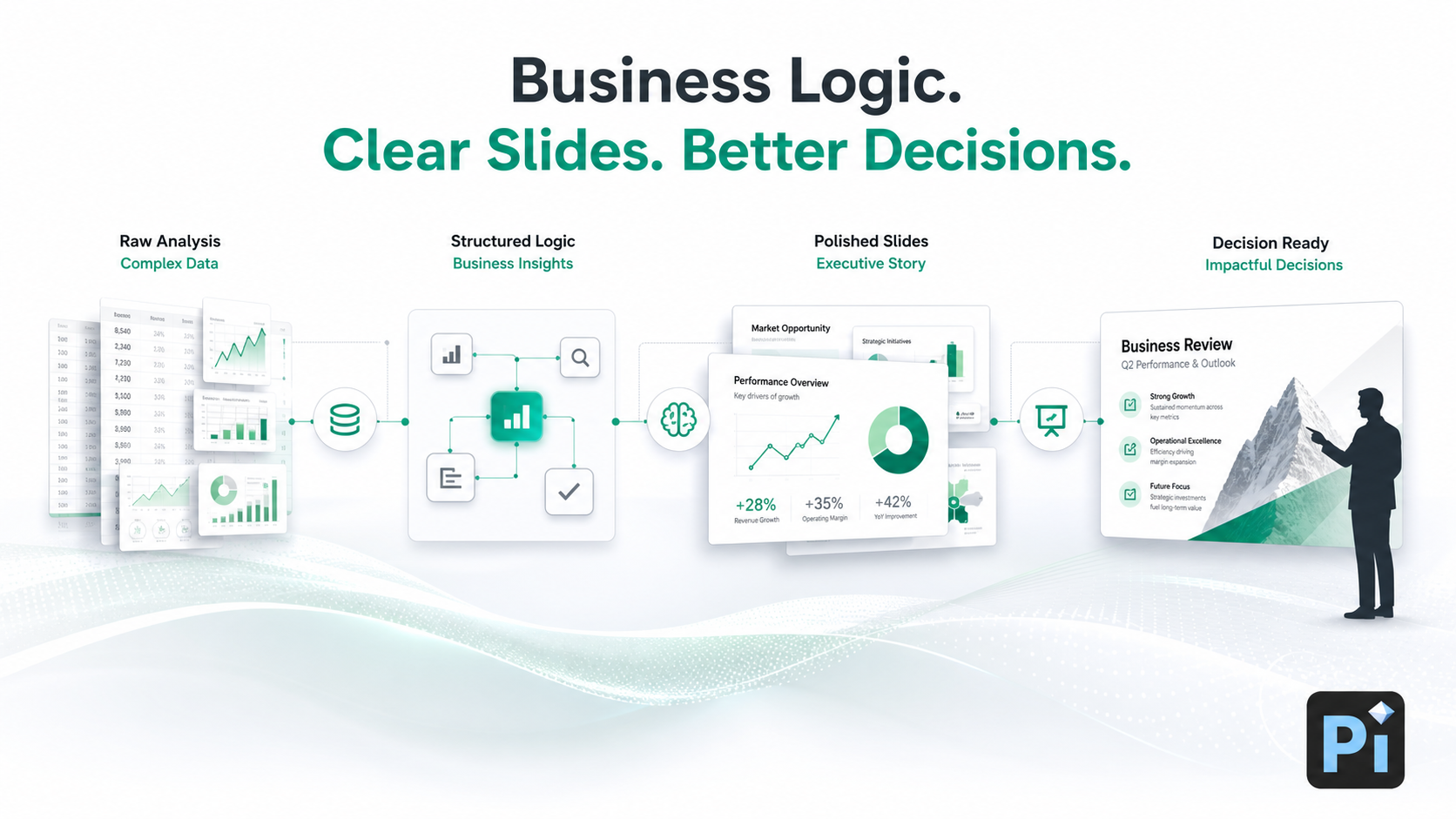
For example, “Q3 churn increased by 4%” is a metric. “We need to decide whether to prioritize onboarding fixes or pricing changes to reduce enterprise churn” is a business decision. The second version gives the data a purpose.
2. Find the One Key Insight
Every data story needs a central message. Supporting metrics can add credibility, but they should not compete with the main point.
Ask: if the audience remembers only one thing from this slide, what should it be? The answer should become the slide title or verbal takeaway. Instead of “Revenue by Segment,” use a title such as “Enterprise accounts drove 72% of new revenue growth.” The chart then supports the insight rather than replacing it.
3. Build a Narrative Arc
A business narrative does not need to be dramatic, but it does need movement. A useful structure is: context, tension, evidence, implication, recommendation.
Context explains the baseline. Tension identifies what changed or what is at risk. Evidence proves the point. Implication explains why the audience should care. Recommendation shows what should happen next. This arc gives numbers meaning and helps the audience follow the logic without getting lost in isolated charts.
4. Choose the Right Data Visualization
Presentation data visualization should be chosen based on the message, not personal preference. If you need to show change over time, use a trend chart. If you need to compare categories, use a bar chart. If you need to show progress against a target, use a KPI view or benchmark. If you need to show distribution, use a histogram or simplified spread.
The right chart reduces cognitive effort. The wrong chart creates friction, even when the underlying data is correct.
5. End with Action, Not Just Analysis
A data story is incomplete if it ends with “here is what happened.” Strong business presentations close with implications, tradeoffs, recommendations, or next steps.
This does not mean forcing certainty where the data is incomplete. It means being explicit about what the evidence supports and what decision the audience should consider. Data storytelling should increase confidence, not create false precision.
How to Present Data Effectively in Business Slides
At the slide level, clarity matters as much as structure. A good data slide should make the key message visible within seconds.
Use the title to state the takeaway, not just the topic. Keep one primary message per slide. Highlight the most important number with size, contrast, or position. Label only what the audience needs to interpret the chart. Remove gridlines, legends, colors, or annotations that do not support the point.
Visual hierarchy https://www.nngroup.com/articles/visual-hierarchy-ux-definition/ is essential. The audience should see the insight first, the supporting evidence second, and the details third. If everything is emphasized, nothing is emphasized.
| Presentation Need | Manual Data Deck Workflow | Pi |
|---|---|---|
| Narrative structure | Often built after charts are selected | Helps organize slides around business logic |
| Data visualization | Depends on manual design skill | Supports cleaner, presentation-ready layouts |
| Executive readability | Requires repeated polishing | Helps create clearer slide hierarchy |
| Business narrative | Often fragmented across slides | Helps connect insight, evidence, and action |
Where Pi Helps Turn Data into a Business Narrative
Pi, short for Presentation Intelligence, is an AI presentation maker built for professional business presentations. It is most useful after the analysis exists, when teams need to translate findings into a structured, polished, business-ready deck.
Pi should not be seen as a replacement for accurate data, sound judgment, or domain expertise. Instead, it helps teams move faster from analysis to communication, especially when the presentation must be clear enough for executives, clients, investors, or cross-functional stakeholders.
1. Business Logic Comes Before Slide Styling
Pi is designed to help structure a deck around the business argument, not just generate attractive slides. That matters for data storytelling because the order of information often determines whether the audience understands the point.
Instead of treating each slide as an isolated visual, Pi supports a more connected workflow: business question, key insight, supporting evidence, implication, and recommendation.
2. Multi-Agent AI Supports a Deeper Workflow
Pi’s Multi-Agent AI helps with different layers of presentation creation, including structure, narrative, content organization, and visual direction. For data-driven decks, this is valuable because the challenge is rarely one-dimensional.
A market research deck, for example, may need analytical framing, audience-specific messaging, polished chart presentation, and an executive summary. Pi helps coordinate these layers into a more coherent output.
3. Premium Aesthetics Make Data Easier to Read
Professional data presentations need more than functional charts. They need premium visual quality that improves comprehension and credibility.
Pi helps teams create slides with stronger hierarchy, cleaner spacing, and business-grade aesthetics. This is useful for high-stakes use cases such as pitch decks, consulting reports, executive presentations, product launch decks, and sales narratives where clarity and polish both matter.
A Simple Data Storytelling Checklist
Before presenting, review your deck against this checklist:
Audience: Who is making or influencing the decision?
Decision: What must they understand, approve, change, or prioritize?
Insight: What is the one message the data supports?
Evidence: Which metrics prove the point without overwhelming the audience?
Visualization: Does the chart match the message?
Implication: Why does this matter for the business?
Action: What recommendation or next step follows from the data?
If any item is unclear, the presentation may need more structure before it needs more slides. The best data storytelling is not about adding information. It is about making the right information easier to understand and act on.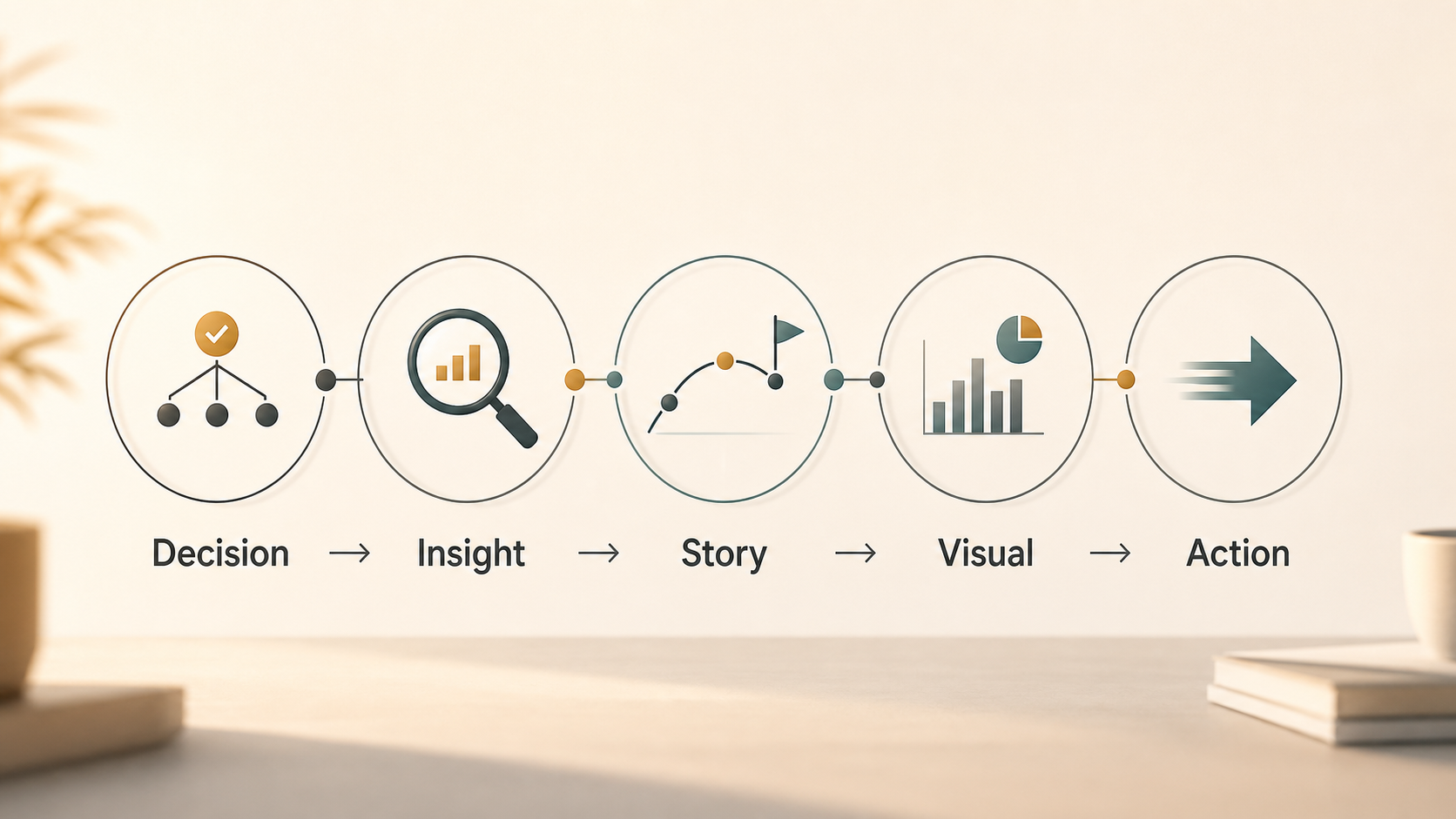
Frequently Asked Questions (FAQ)
Q: What is data storytelling in a business presentation? A: Data storytelling is the process of turning metrics into a clear business narrative. It combines insight, structure, and presentation data visualization so the audience can understand what the numbers mean and what action should follow.
Q: How do I present data effectively without oversimplifying it? A: Start with the business decision, identify the key insight, and use supporting metrics selectively. You can preserve nuance through annotations, context, and backup slides while keeping the main presentation focused on the message.
Q: What makes a strong business narrative for data-heavy slides? A: A strong business narrative connects context, tension, evidence, implication, and recommendation. It explains not only what happened, but why it matters and what the audience should do next.
Q: Can AI help create better data storytelling presentations? A: Yes, if the underlying data and analysis are accurate. AI tools such as Pi can help organize insights, improve slide structure, and create polished visuals, but they should support human judgment rather than invent business conclusions.


